Brief:
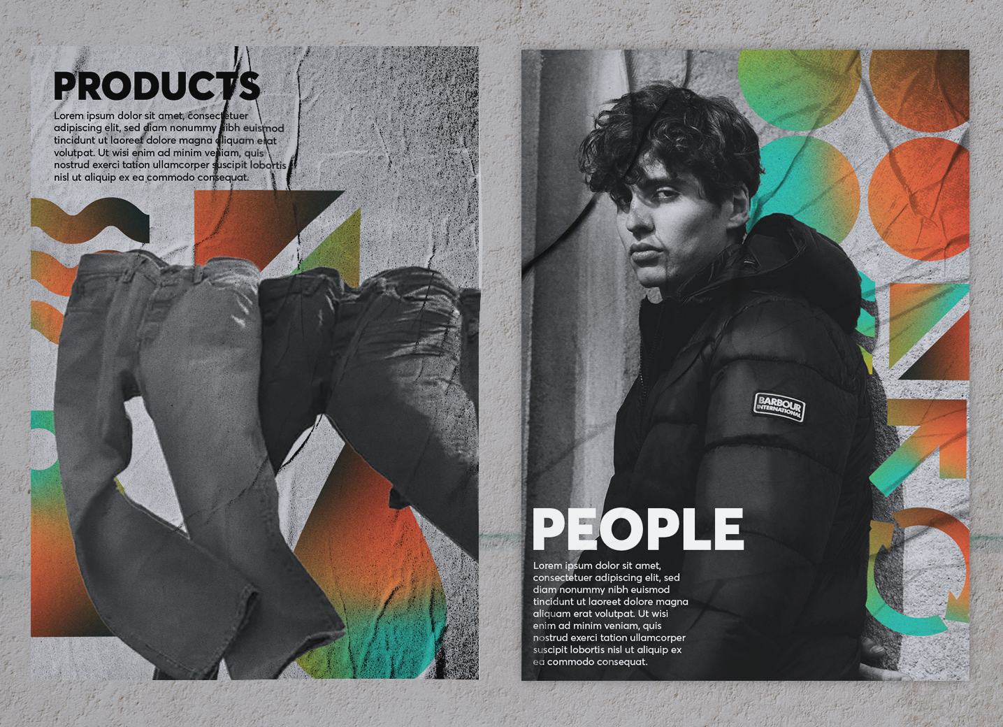
Develop a visual identity that reflects the core values and mission of the sustainability department. Emphasize the department's innovative and progressive approach while showcasing its three key components: people, products, and channels.

Inspiration
I derived inspiration from existing brands that utilize a strong, bold font
similar to Averta. This allowed me to observe how the style effectively complements the font. Additionally, I explored brands that have successfully communicated sustainability, examining their use of iconography, colour, and texture.
similar to Averta. This allowed me to observe how the style effectively complements the font. Additionally, I explored brands that have successfully communicated sustainability, examining their use of iconography, colour, and texture.

Colours & Textures
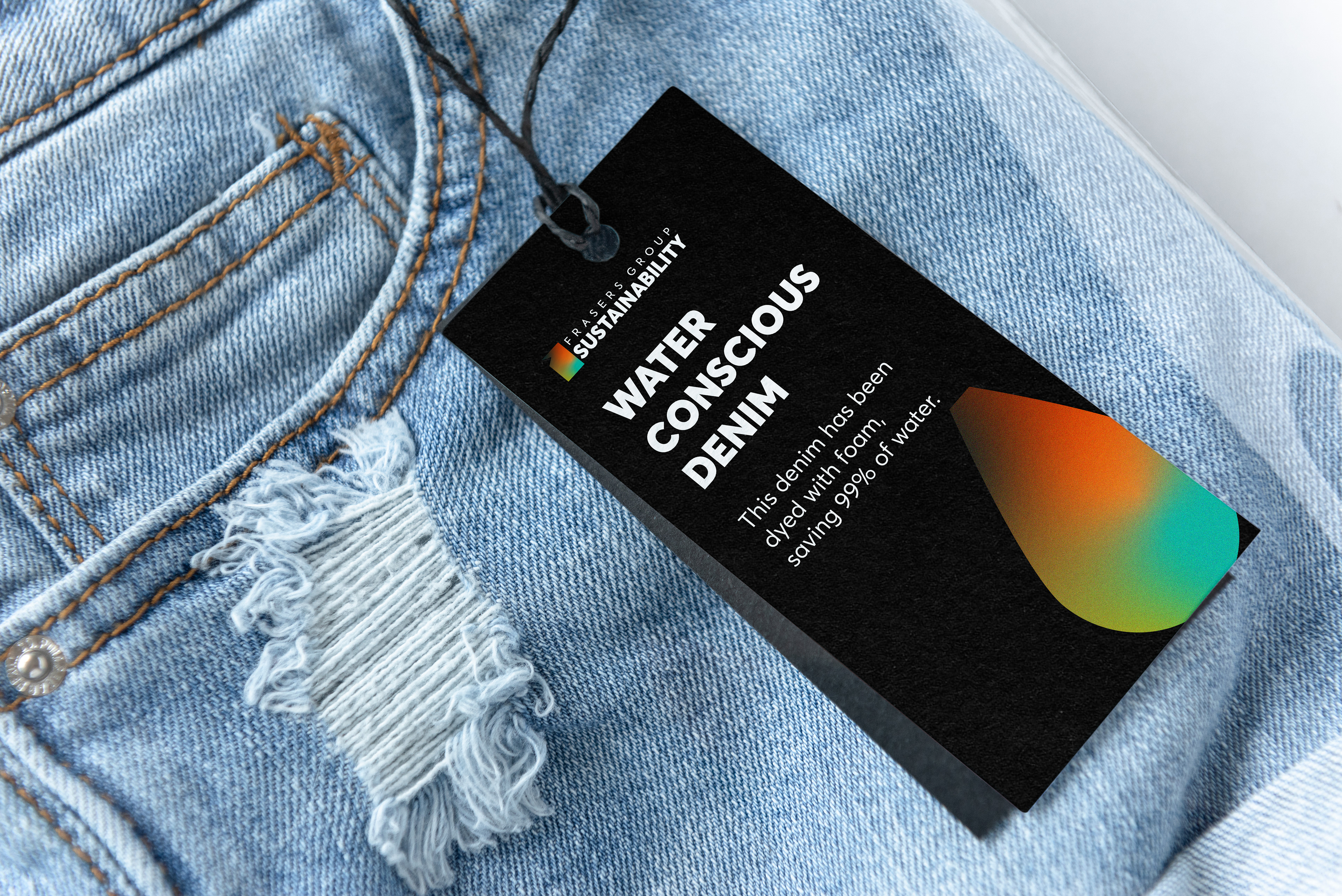
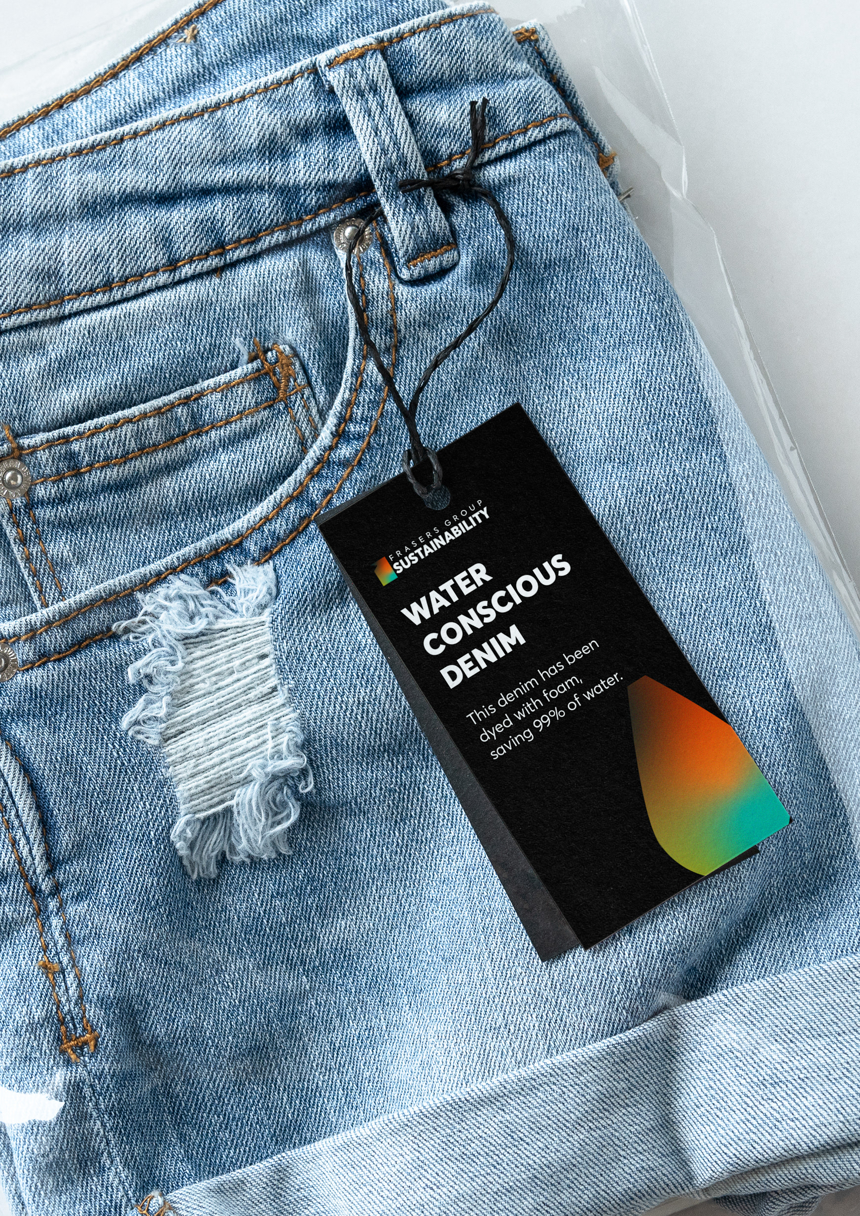
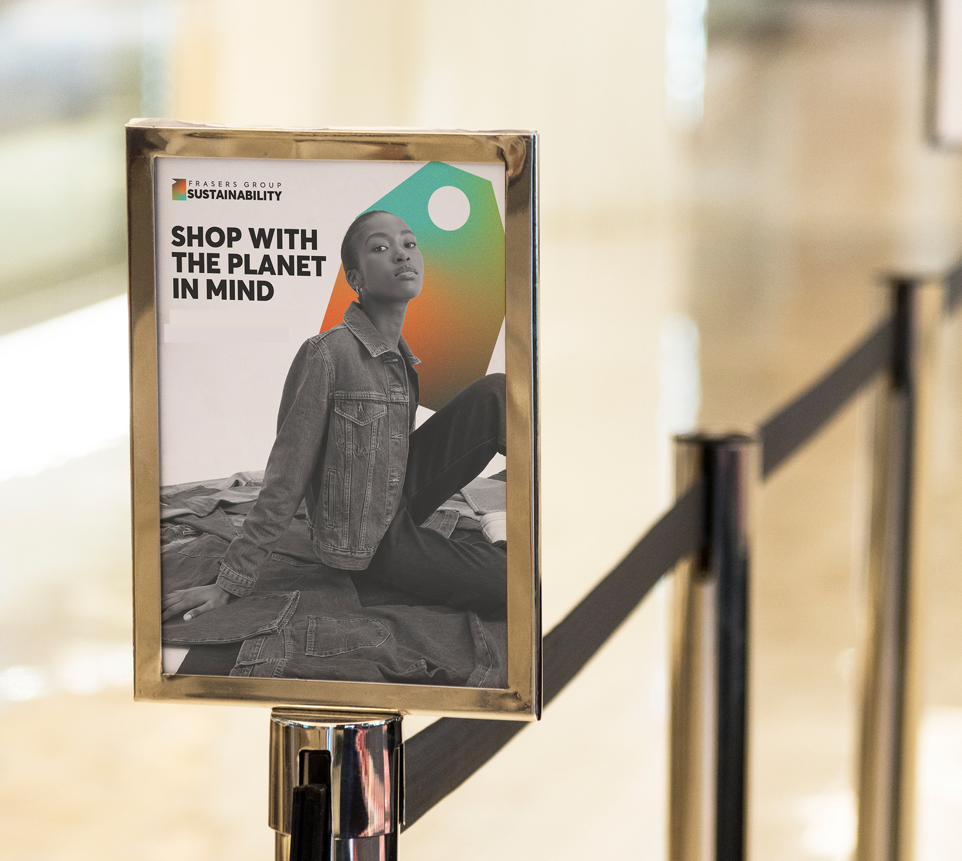
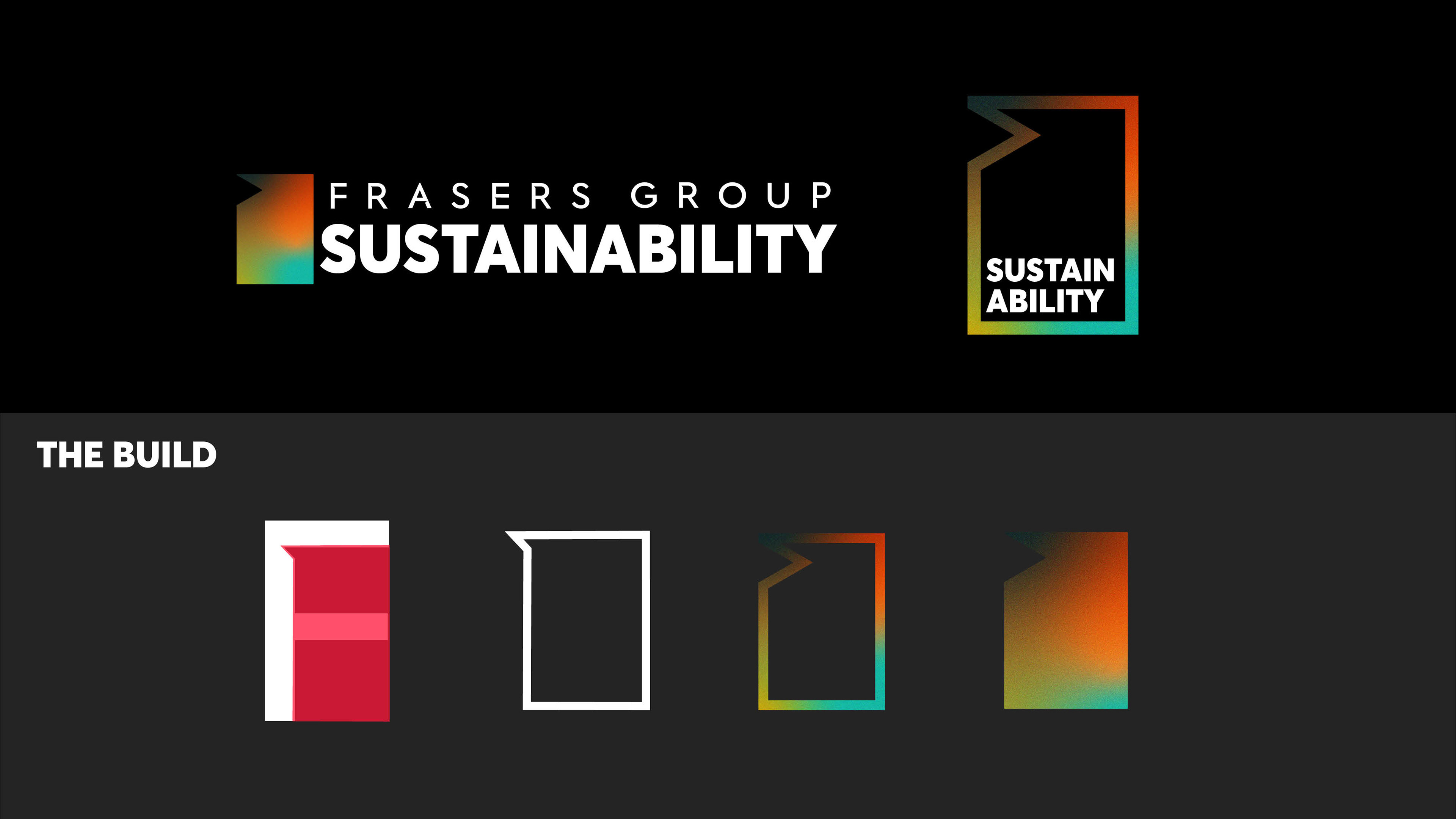
I took the original blue, pink, and orange colours and adjusted the shades to develop a more earthy palette that complements the Frasers' black and white scheme. I then incorporated these colours into a gradient and added a noise texture for a refined finish.

Logo
I designed the logo using the negative space within the “F” of Frasers Group. By inverting the triangle, the design symbolizes the company’s
introspective focus on enhancing sustainability efforts across the group.
introspective focus on enhancing sustainability efforts across the group.
Iconography
I chose to champion the three main components of the framework with abstract icons. I then made a range of secondary icons that can sit together as a brand pattern or supporting graphics for any digital or print visuals.