Brief:
The founders of Noodoo, with deep roots in the music industry, recognised a unique opportunity to introduce an alcohol-free product to an industry traditionally dominated
by alcohol brand sponsors.
by alcohol brand sponsors.
Illustration is at the core of the brand, and it needs to capture the essence of “In High Spirits.” The brands strapline.
Noodooo is looking for a packaging design that is distinctive and becomes
synonymous with the brand.
synonymous with the brand.
Moodboard
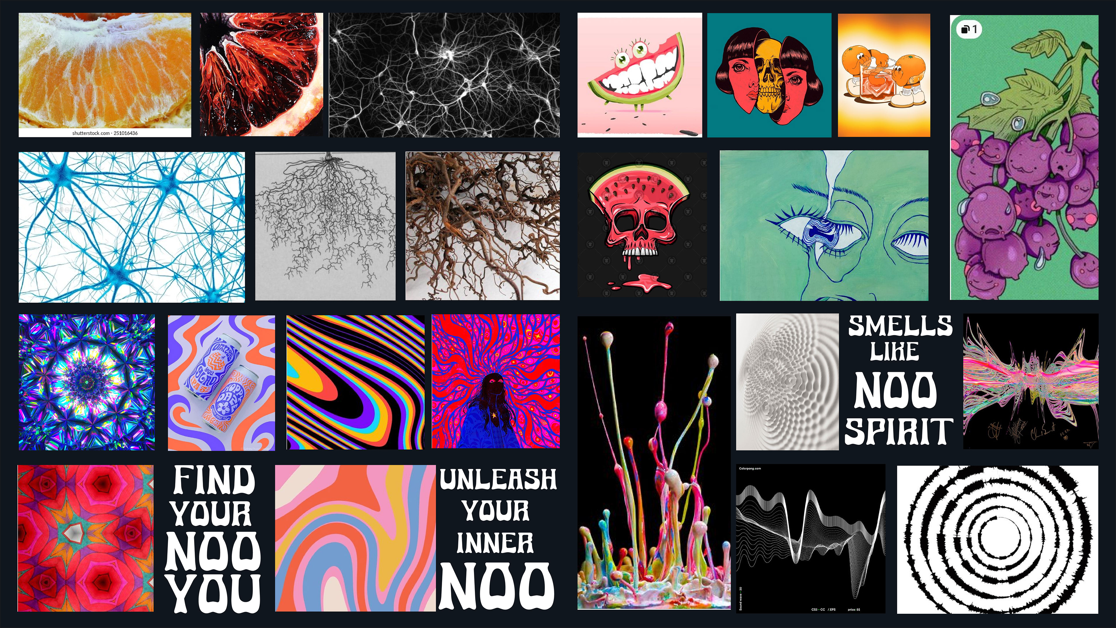
I gathered a range of different imagery for my moodboard to start my creative concepts, including sound waves, roots, neuroreceptors and psychedelic illustration.
Route 1
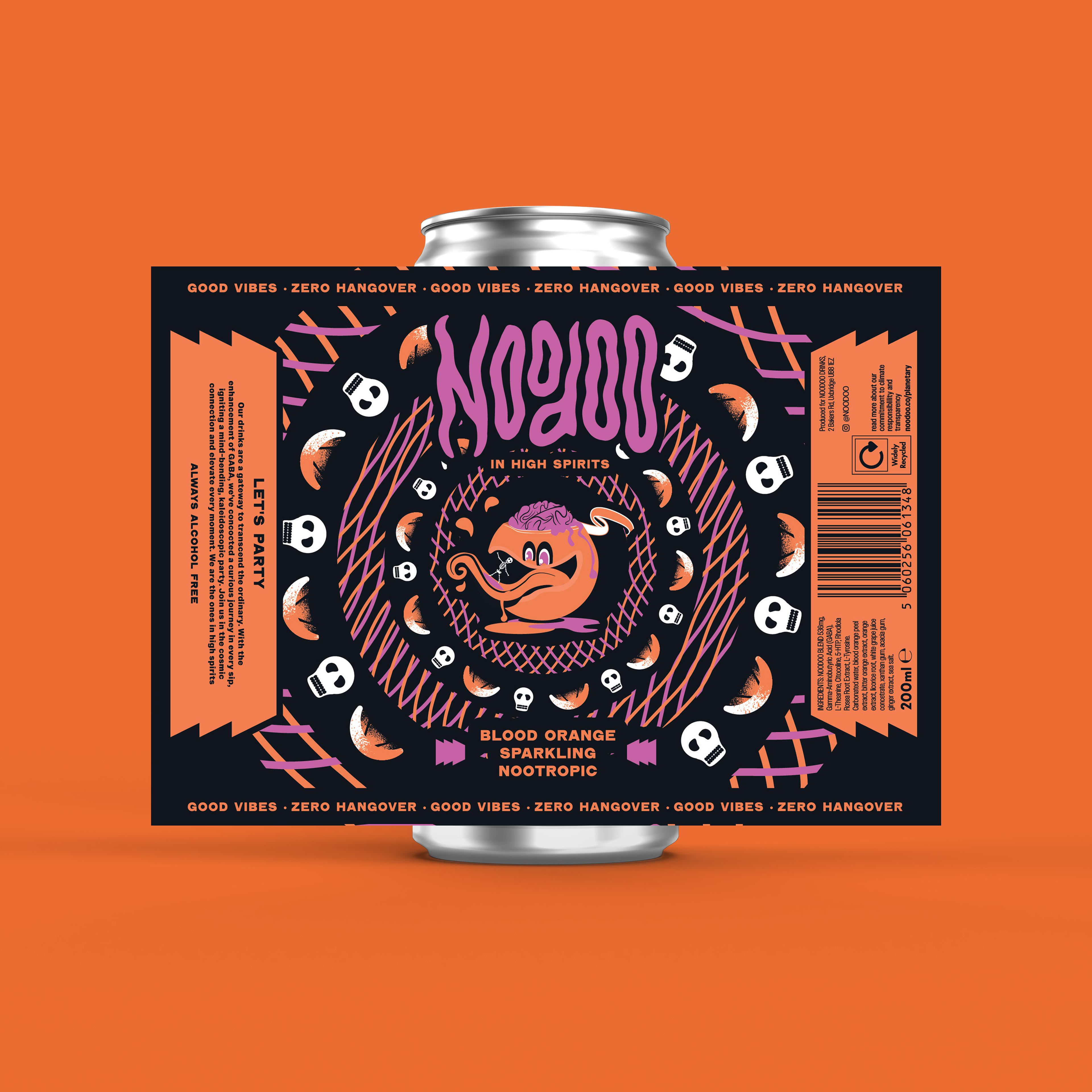
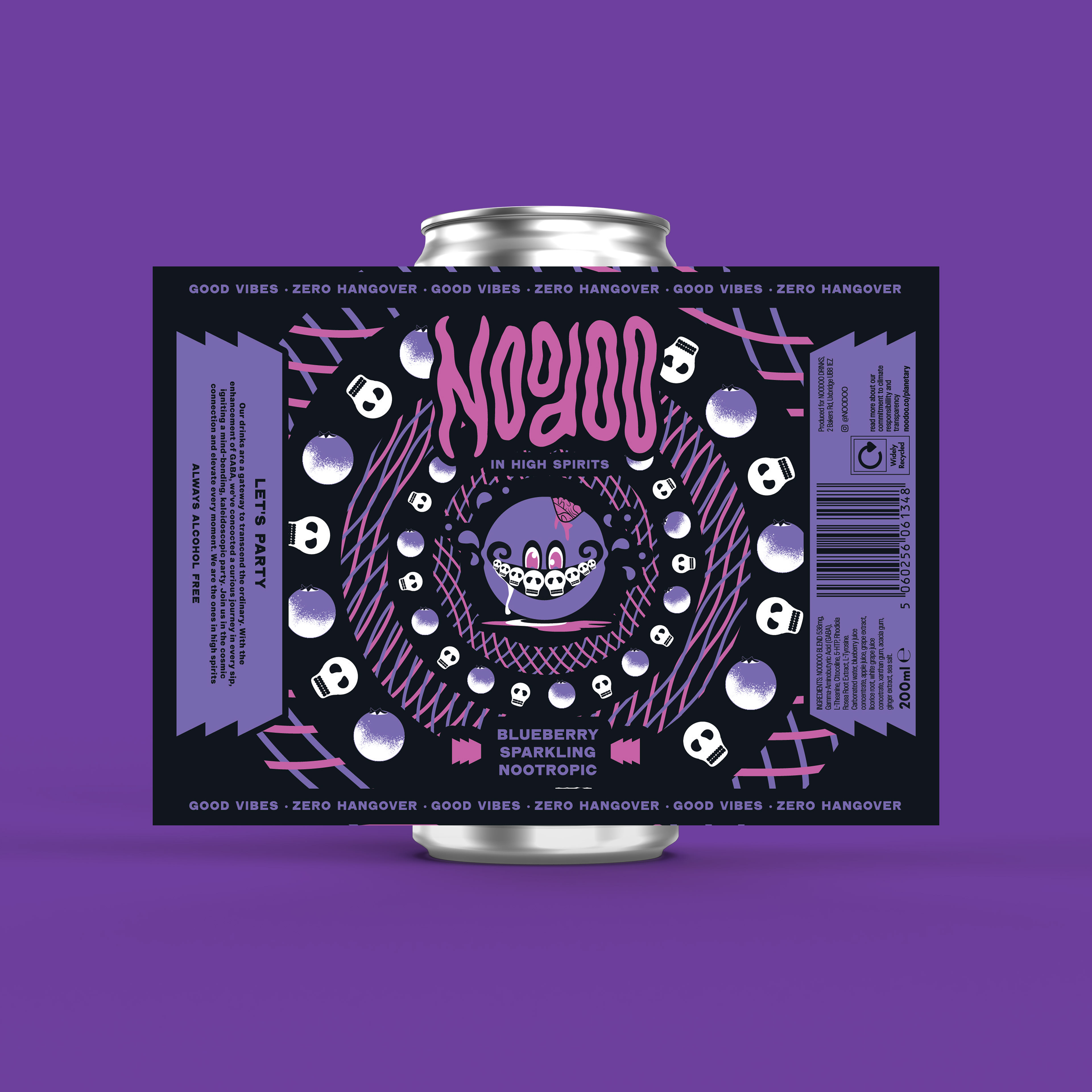
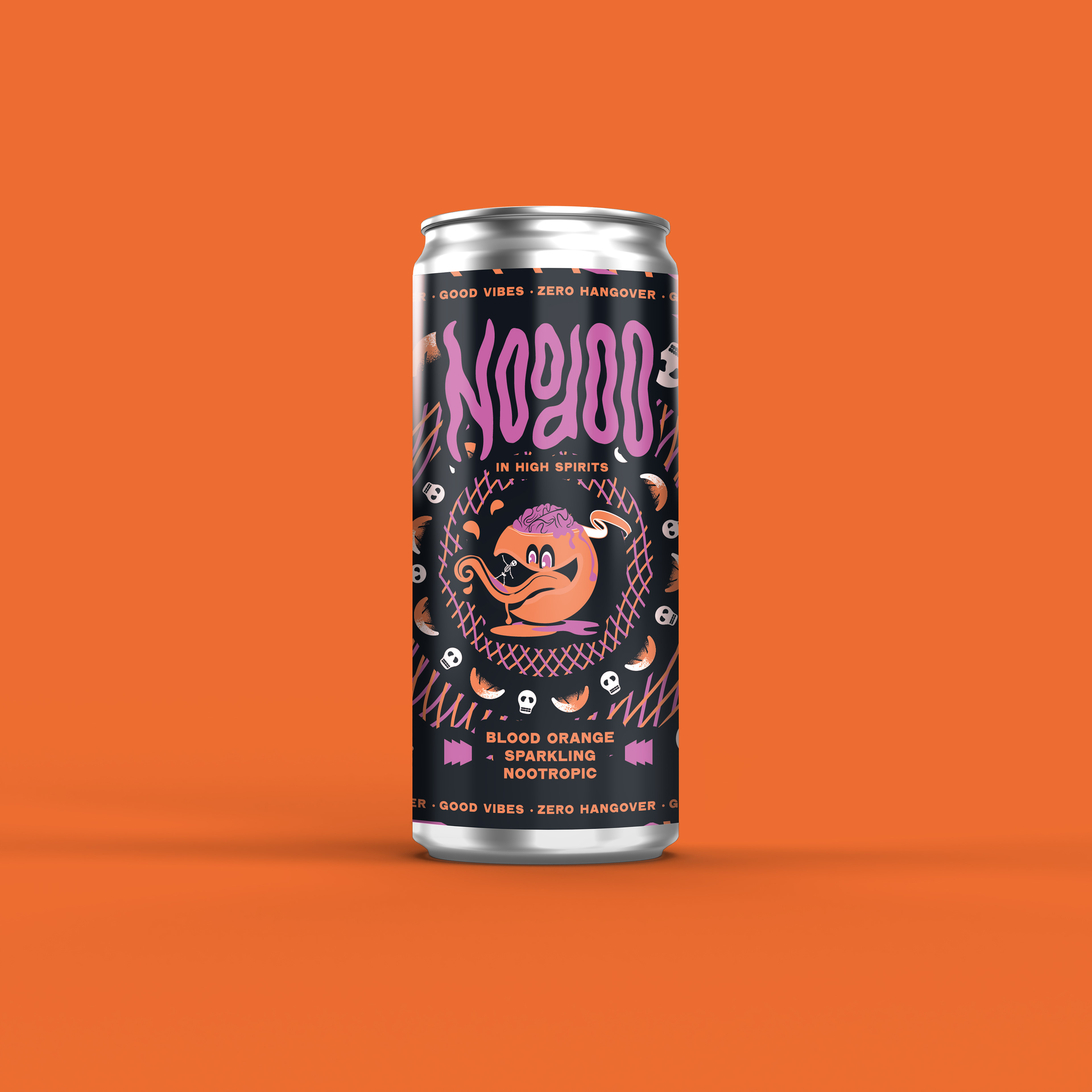
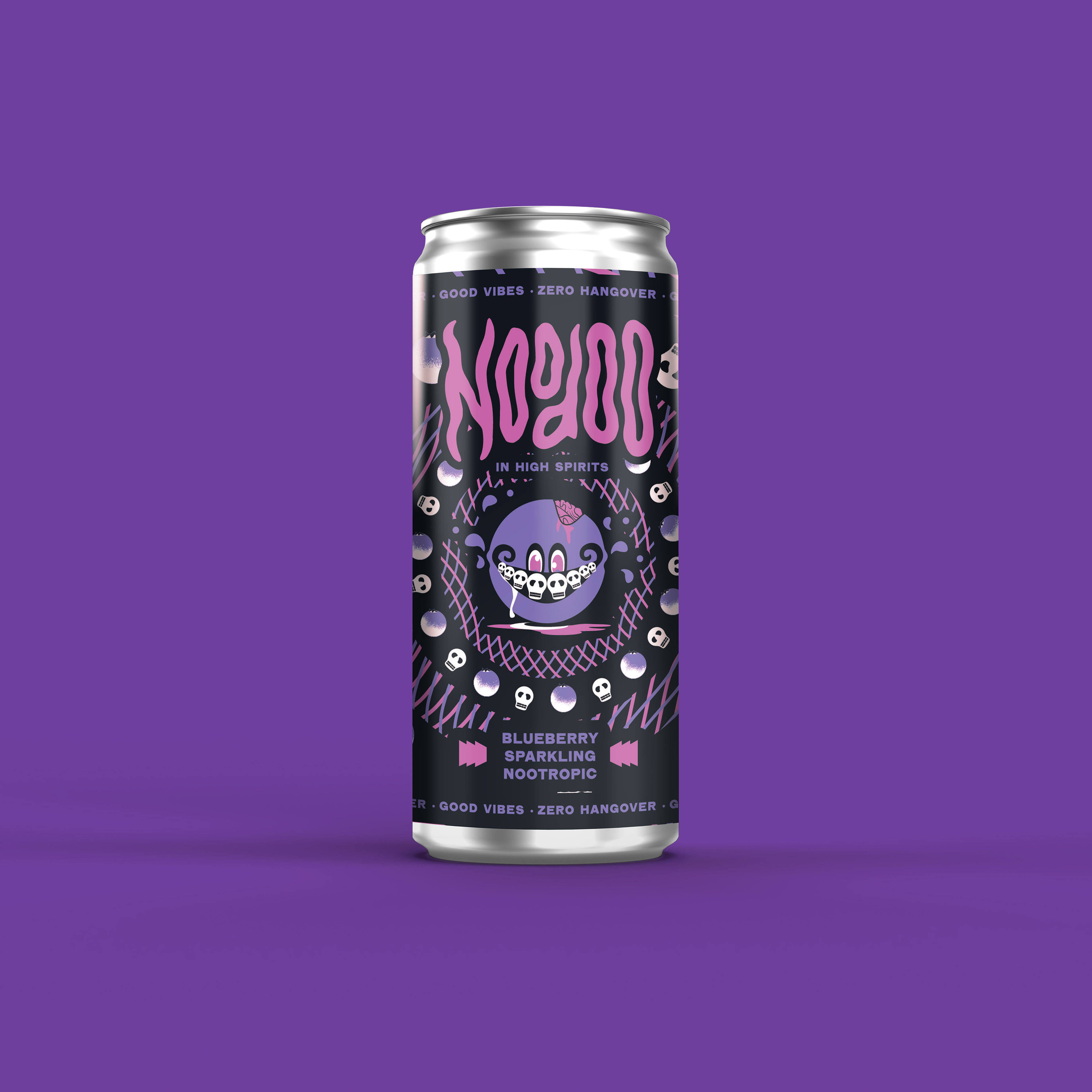
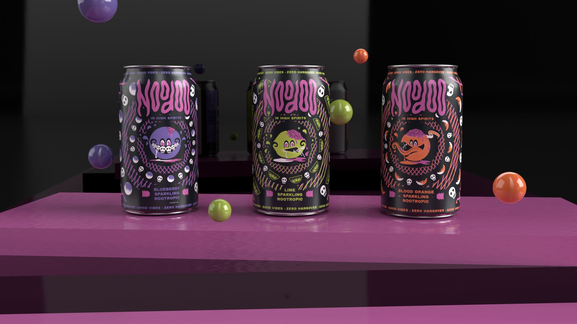
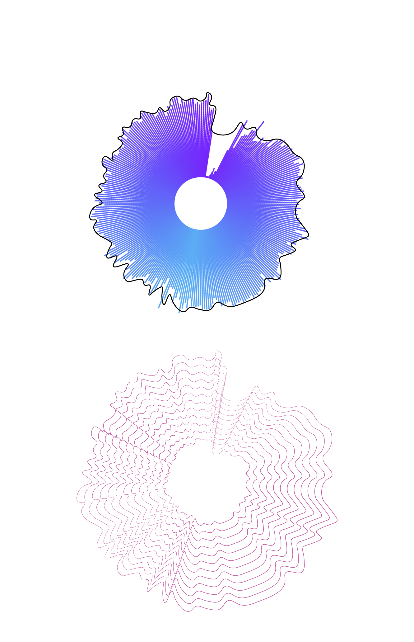
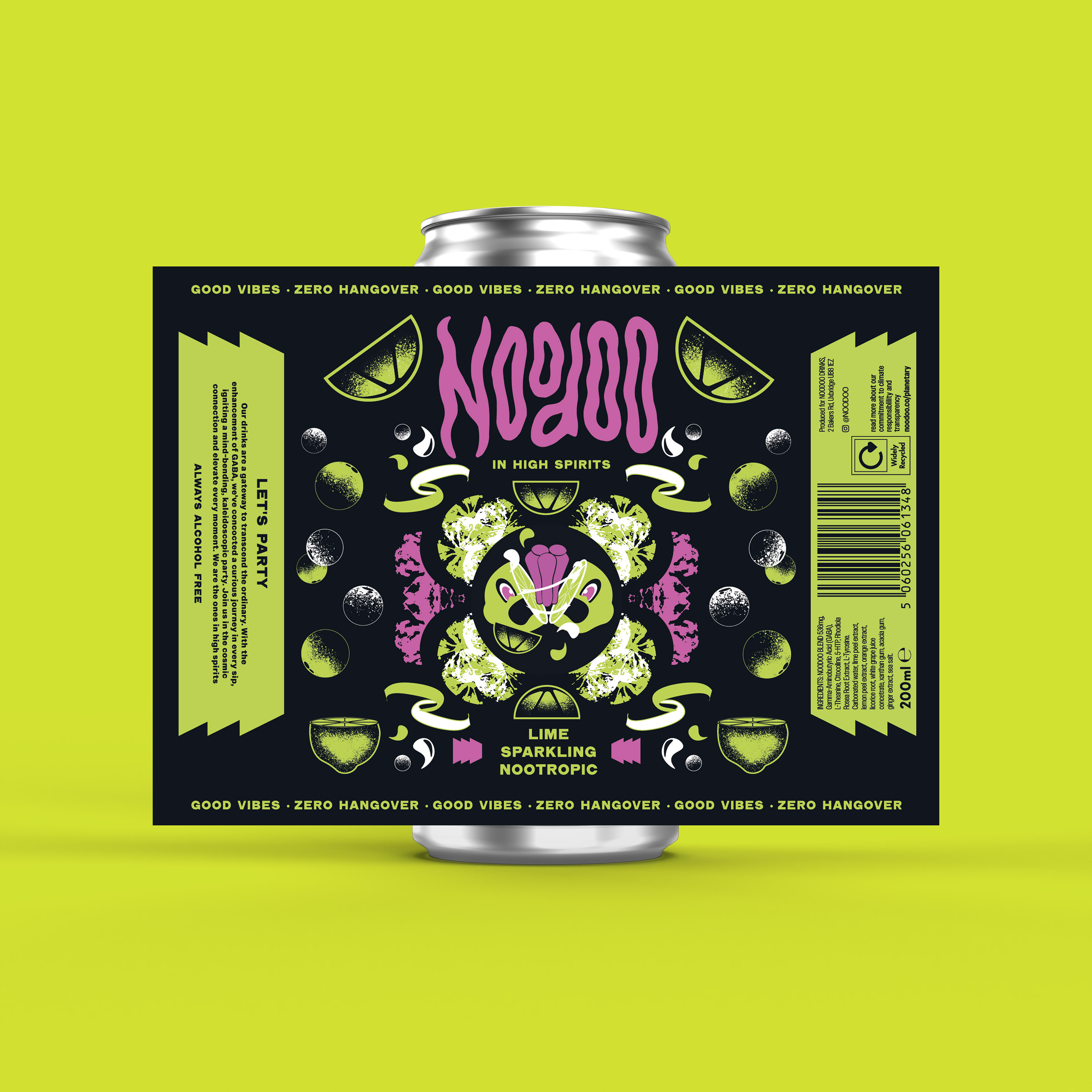
Remembering that this brand is routed in music, I chose to map a soundwave to create a blend effect that frames my central illustration. In my central illustration I have created characters based on the flavours of each drink. I then chose to put human skeletons in their mouths to create this psychedelic world where the fruit eat people rather than people eating fruit.

Route 2
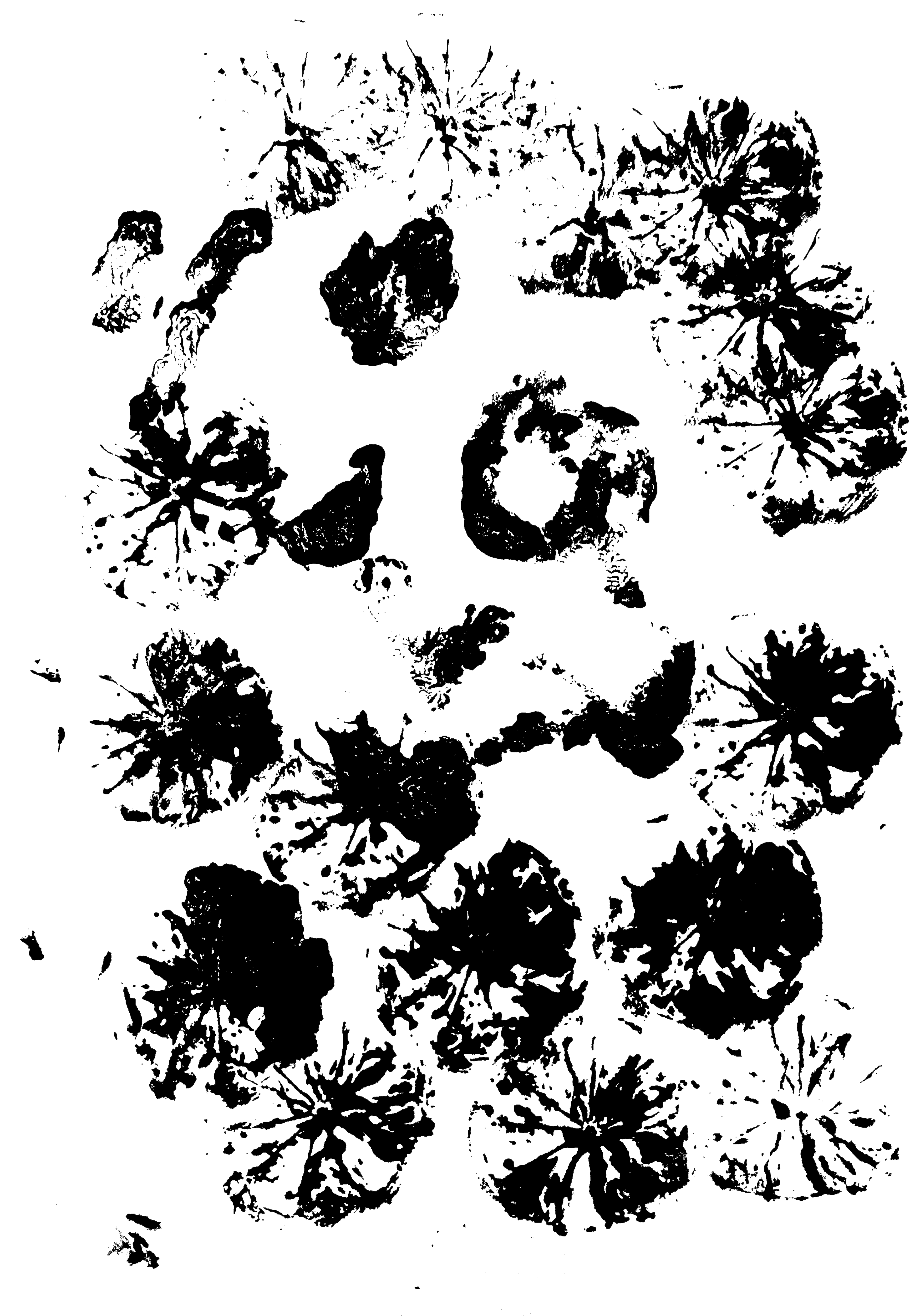
For my second outcome I painted parts of limes, blueberry's and oranges and printed them onto paper to create textures. I then used theses textures to create a kaleidoscope effect to frame my central illustration. Because these textures came out so detailed I chose to balance these out with bubbles and lime textures around the edge of the label making sure I kept the symmetrical aspect all the way through the design.
Route 3
Developing my second route further I chose to build a vortex around my centeral illustration for my third design. I created a set of wavy line following the path of the ‘o’ in the logo. I then used the blend tool to duplicate the lines. I then put the blend into a ring and built the vortex around my illustration enhancing this psychedelic world.